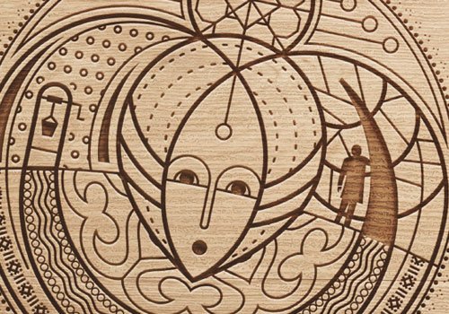
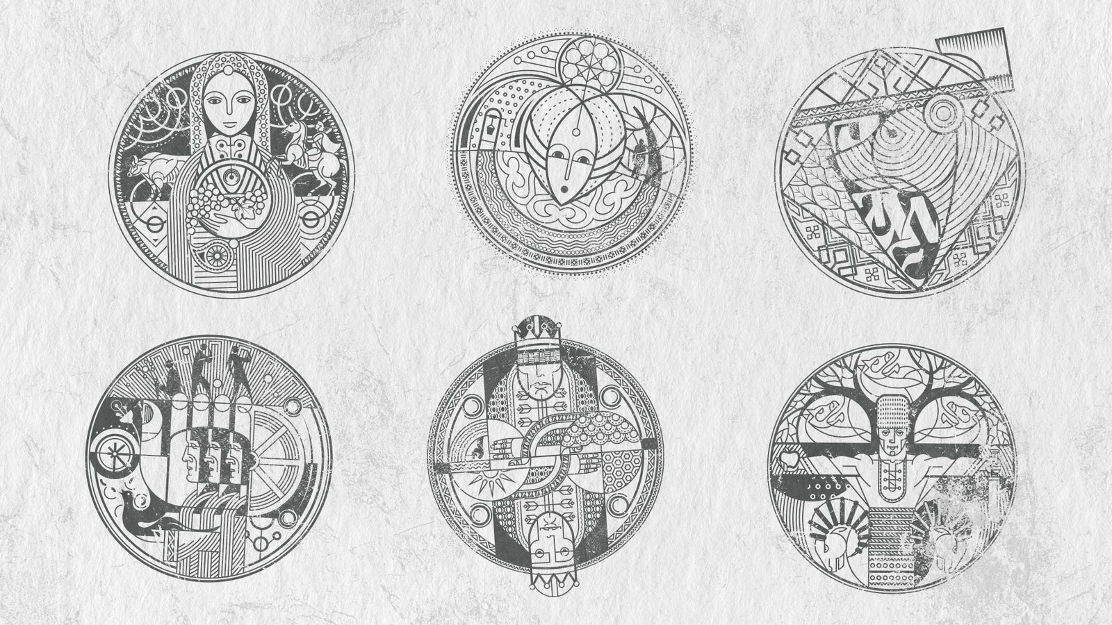
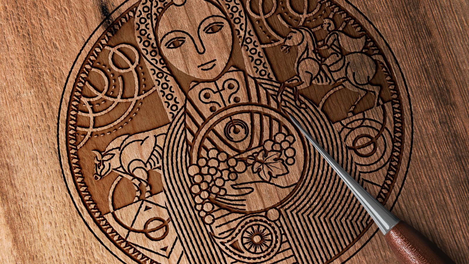
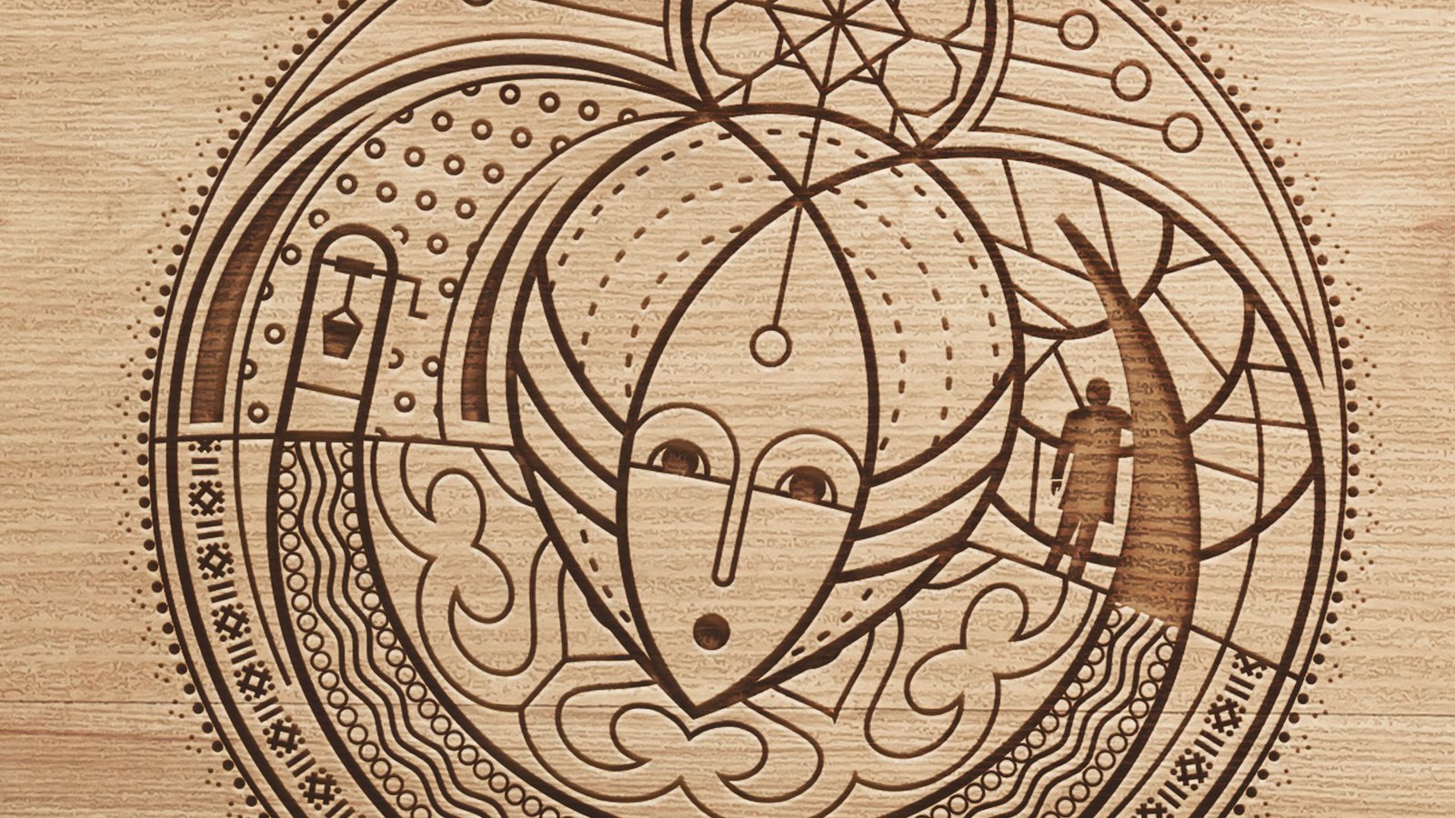
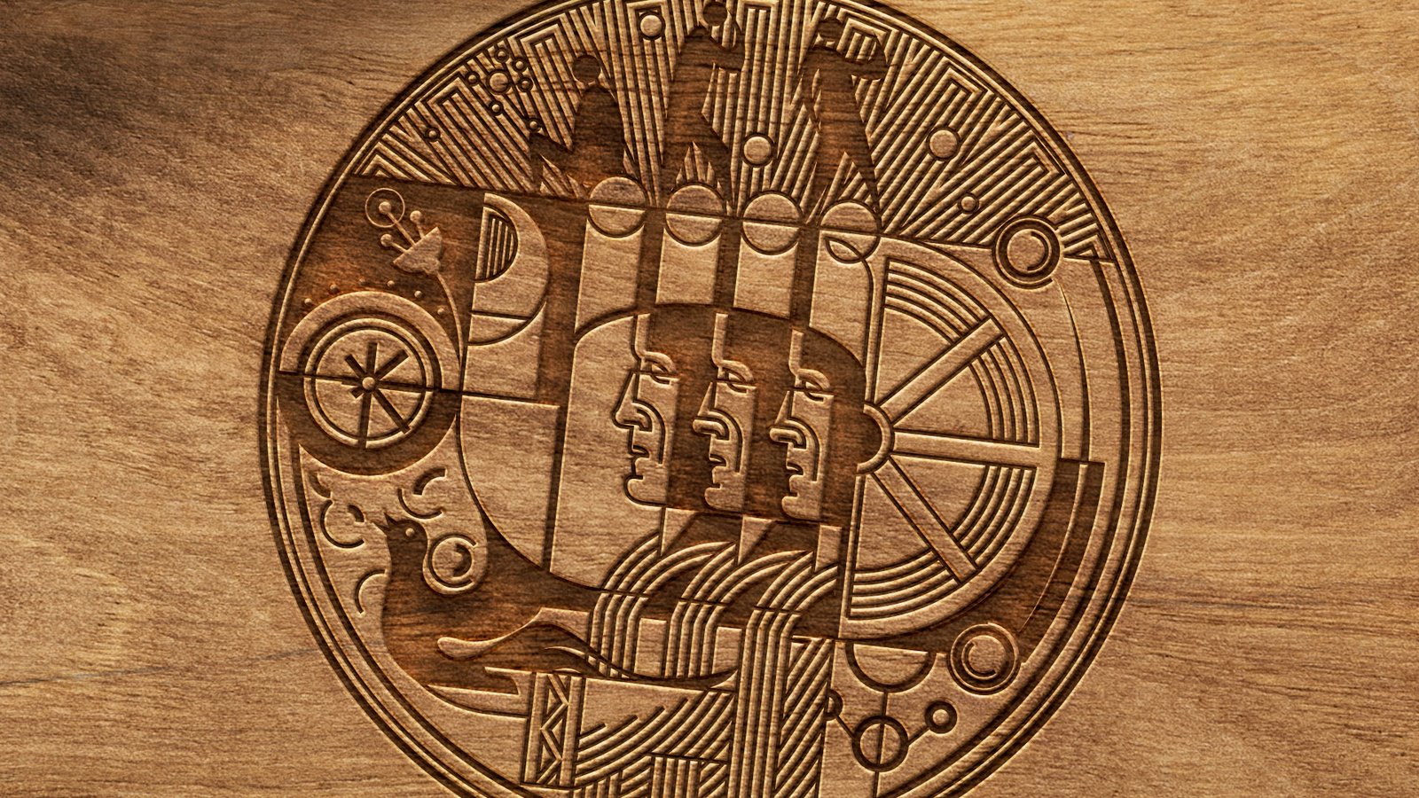
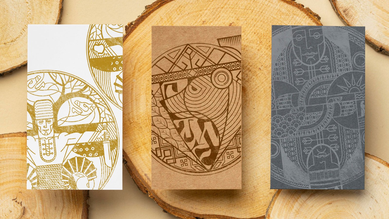
drawings
Fairytales


Client: Ged Ltd.
Task: To develop a series of six visions illustrating popular Bulgarian folk tales. They should be suitable for engraving and printing on various surfaces (leather, wood, cardboard, etc.).
Realization of the project: I created the images in the style of letterpress engraving, sticking to a simple and abstract look, containing recognizable images from each of the works.
logo design
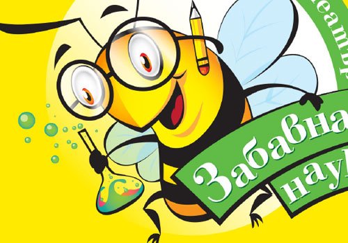
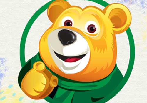
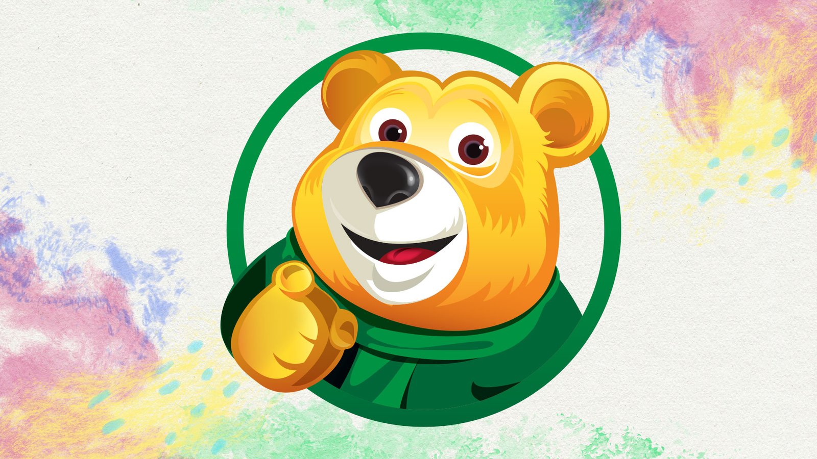
Fun Science
Task: Development of a logo for a children's educational theater and playroom named "Fun Science."
Requirements: The logo should convey the joy of learning while emphasizing the connection with children's education. A bee must be included as a symbol of activ work, and continuous learning.
Realization of the project: Colors such as orange, yellow, and green have been utilized, not only appealing to children but also associating with nature. The main character, the bee, is designed in an cartoon style, allowing it to serve as an illustration or part of one in the future. A playful yet easily readable font has been chosen, ensuring legibility even at a smaller size.
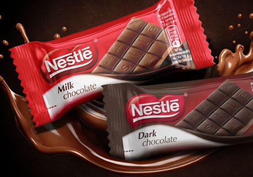
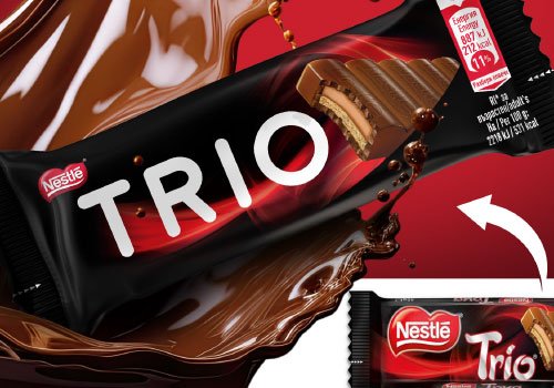
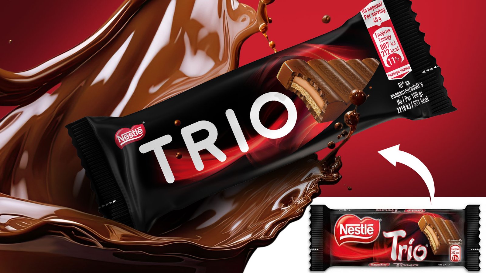
package design
Chocolates
Client: Nestle Bulgaria
Task: To design a series of two packs for small chocolate bars. It is important that the logo and the product are easily visible, and the type of chocolate is easily read.
Realization of the project: Design work: I color worked and retouched the product photos. I selected the appropriate colors, gradients and font. For greater readability, I separated the text from the product using chocolate wool and placed it on a light background where it would contrast.
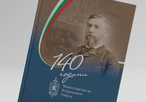
printed materials
Album
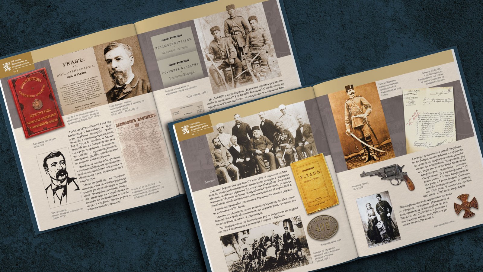
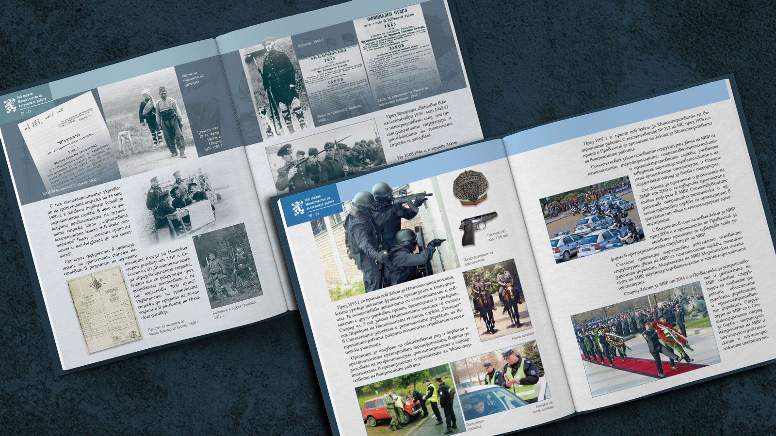
Client: Museum of The Ministry of Interior of Bulgaria
Task: To prepare a retrospective album on the occasion of 140 years since the foundation of the Ministry of Internal Affairs.
Design work: I did the design of the hard cover and the body of the book, according to a predetermined format. I edited and retouched the photos, bringing them to a print-ready look. I selected a font that was fit for purpose, using it in a variety of ways and designs for the different elements of the page layout. I created a unique color palette for each of the album sections.
logo design
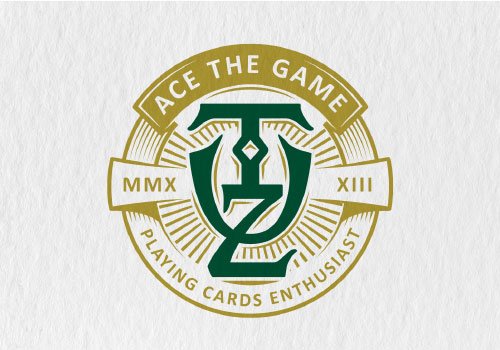
TUZ
Task: Tuz is a line of luxury playing cards produced in small, exclusive runs specifically designed for collectors. The logo should reflect the premium and exclusive nature of the product, creating a visual identity that resonates with the discerning tastes of collectors.
Requirements: Emphasize the inscription with the name of the company.
Design work: A custom inscription that weaves into itself the name of the brand. It is designed to create a retro feeling of handmade metal engraving. The color palette includes deep, rich colors such as golds and dark greens to evoke a sense of luxury and sophistication.
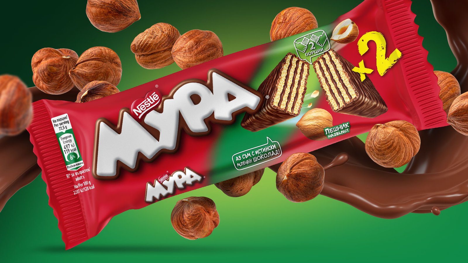
package design
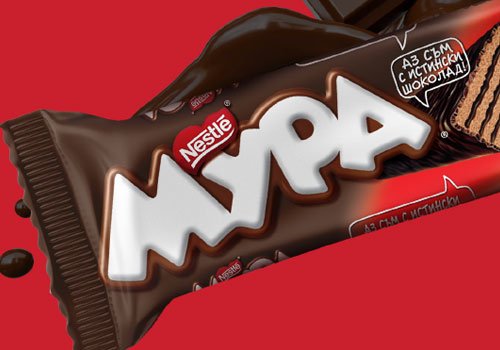
Wafers
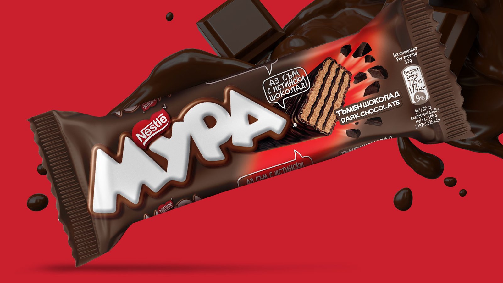
Client: Nestle Bulgaria
Task: Design of wafer packaging with dark chocolate and hazelnut flavors from the Mura series.
Realization of the project: Packaging design, photo processing and placement of visual and text elements according to the specific requirements of the customer.
package design
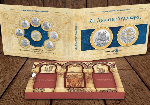
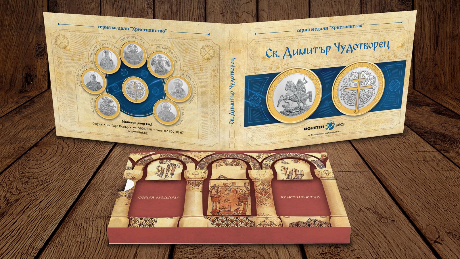
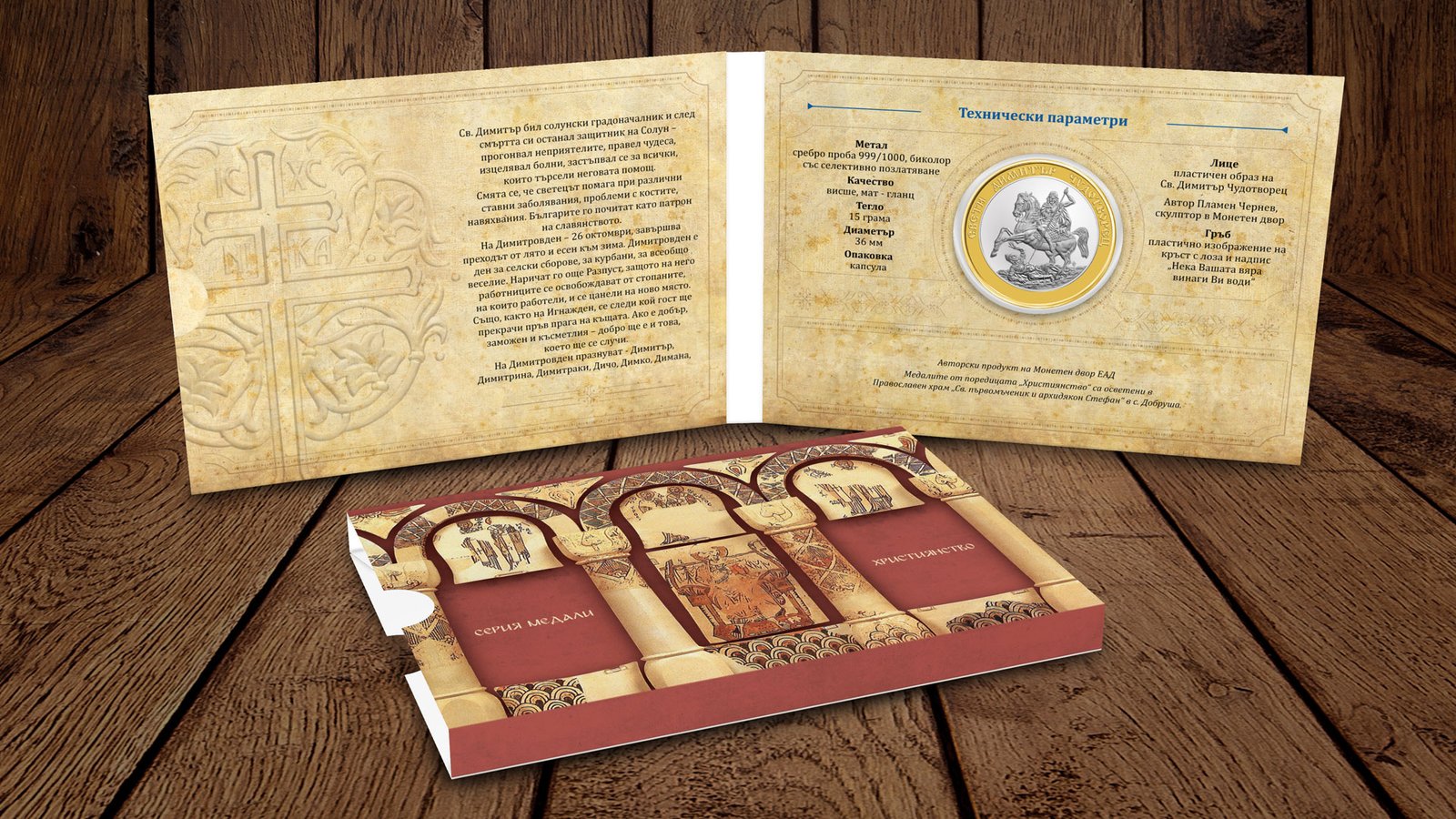
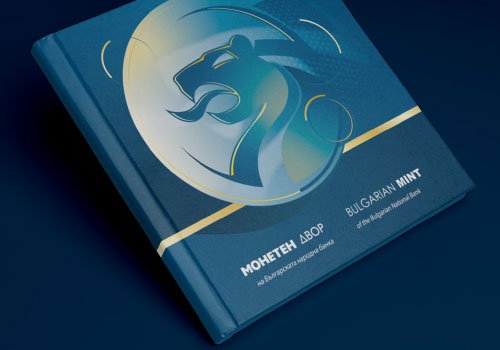
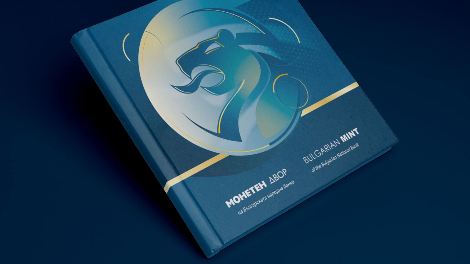
Medal album
Client: Bulgarian Mint of the Bulgarian National Bank
Task: Album type packaging that goes into a safety pocket. There is a capsule slit in the album containing a medal on one side and place to insert a greeting card on the other.
Realization of the project: Photo capture and processing of products. As a background is used parchment texture, which create a sense of antiquity. The graphic elements developed for the project resemble those of a orthodox medieval manuscript, but recreated in a modern and different way.

drawings
Charge
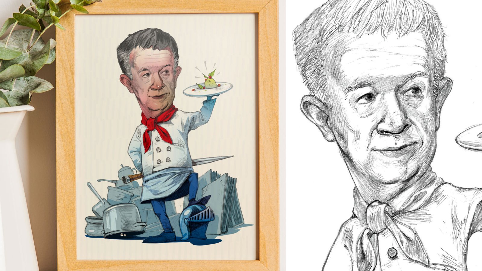
Realization: Birthday gift for a colleague, chef enthusiast. The project combines pencil drawing with coloring through graphic software.
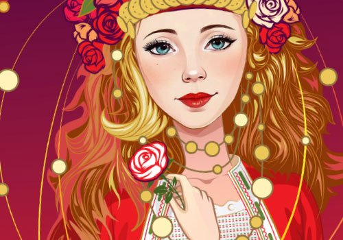
drawings
Character
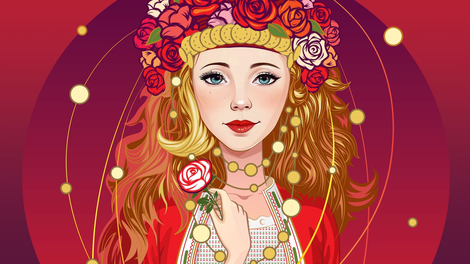
Client: Rosaimpex
Task: To draw a pretty young girl. Have a rose element due to the specifics of the product for which the creative is intended.
Realization: A portrait of a girl in a folk costume is in a vector style with predominant warm, red shades.
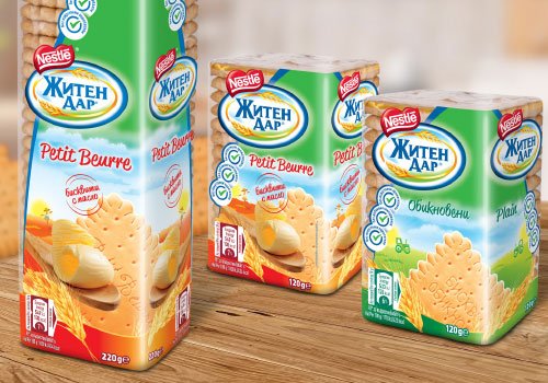
package design
Biscuits
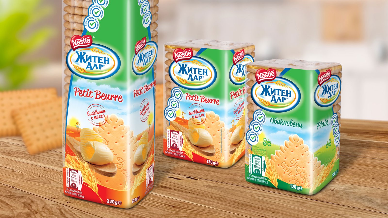
Client: Nestle Bulgaria
Task: Two types of biscuit packaging design. Three "stamps" and the new product look must be included.
Realization of the project: I started by processing the product photography. I implemented the design elements (background, colors, lettering, etc.) so that they correspond to each other, but the two flavors are easily recognizable.
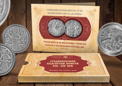
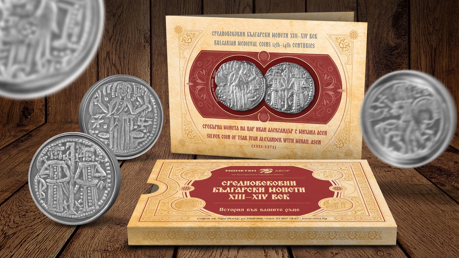
package design
Medal album
Client: Bulgarian Mint of the Bulgarian National Bank
Task: Album type packaging that goes into a safety pocket. There is a capsule slit in the album containing a silver medal on one side and place to insert a greeting card on the other.
Realization of the project: Photo capture and processing of products. As a background, the texture of old paper and waves of matte blue fabric are used, which create a sense of antiquity. The graphic elements developed for the project resemble those of a medieval manuscript, but recreated in a modern and different way.
drawings
Mascot
Realization: Vector drawing of a mascot for an online platform dedicated to services and mutual assistance.
printed materials
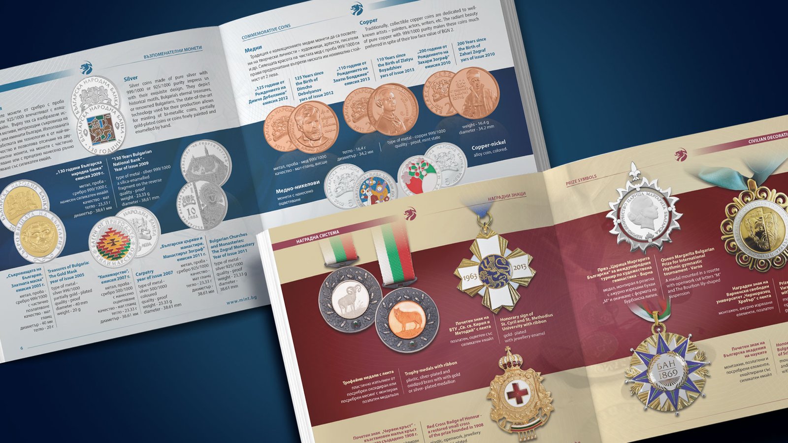
Catalog
Client: Bulgarian Mint of the Bulgarian National Bank
Task: Graphic design of a catalog including a representative part of the manufactured products, their description and technical characteristics.
Design work: I started the project by photographing most of the products, color processing and photo retouching. The challenge at this stage was to adjust the light and set up the technique to capture even the smallest details on the coins, medals and other products. In the subsequent color processing of the images, I had to make sure that the various metals and surfaces were correctly reproduced. For the cover I created an abstract, image design using the emblem of the Bulgarian Mint. The design of the internal pages focuses on the products, with each section being distinguished by its own color scheme.
printed materials
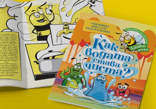
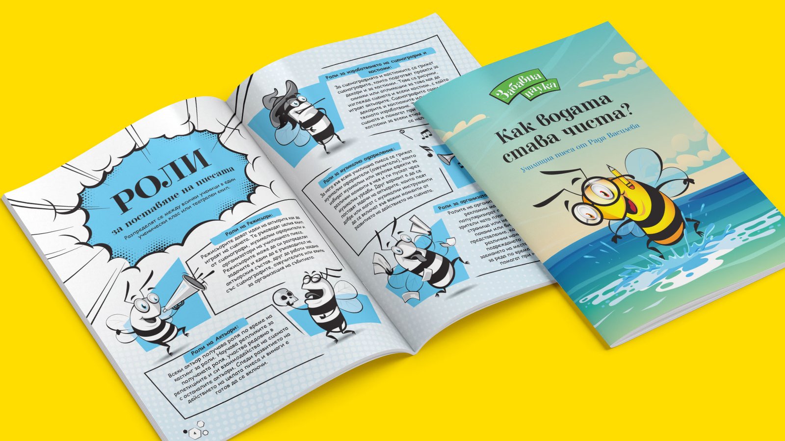
Scriptbooks
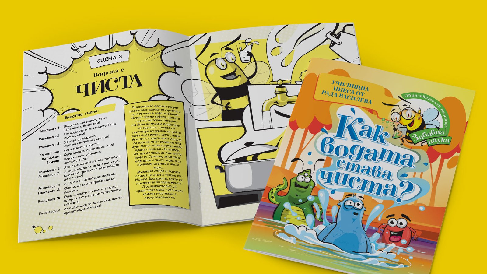
Client: Fun Science
Task: Graphic design and illustrations for a children's play scripts.
Design work: I started work on this project having a predefined release format. The technical limitations were that unlike the cover, which is full color, the body of the book had to be printed in only two colors. Given the children's audience for which the script is intended, I made the design in a comic book style. I used the style of the character from the client's logo as a starting point when creating the rest of the illustrations in the booklet.
package design
Chocolate bar
Client: Nestle Bulgaria
Task: Redesign of chocolate packaging. The general location of the elements is preserved, but the new larger nutrition information must be placed. The name of the product should be more readable. The picture of the product should be larger.
Realization of the project: Given the increase in many of the elements, the manufacturer's logo had to be drastically reduced at the expense of the product name. I made the inscription clean and easily readable, which was contributed by the additional distance between the letters. I retouched the visualization of the chocolate bar to take up more space. I reduced the background activity in certain places and merged it visually with the product through an ascending rounded shape, which contributed to the clearer graphic rhythm in the package.
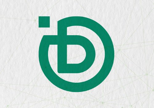
logo design
Debatum
Debatum is a fully decentralized platform powered by the blockchain technology that enables communities around the globe to engage in truly democratic and transparent discussions while earing rewards for their participation by utilizing an innovative incentivization mechanism
Task: Logo for a blockchain platform.
Requirements: The logo should emphasize the technological and modern nature of the "Debatum" platform.
Design work: Combination of two elements - a easily readable inscription that conveys the technological essence of the platform and an icon with an abstract yet easily recognizable design.
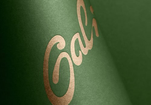
logo design
Gali
Task: Design of a logo for a trader of organic olive oil.
Requirements: A simple logotype suitable for single-color use.
Design work: A fluent, organic, handwritten inscription in natural green primary color.
printed materials
Catalog
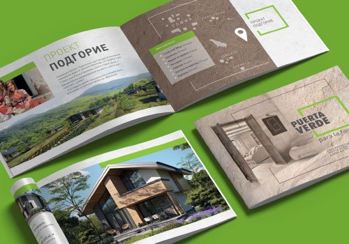
Client: Puerta verde
Task: To design a catalog with the projects of an investor dealing with eco-friendly construction.
Design work: I chose a landscape format for the catalog to correspond with the panoramic nature photos in which the architecture fits. As the main colors I chose beige, gray and light brown tones, as well as textures of natural materials such as stone, limestone, marble, wood, etc. For an accent, I used the fresh, bright green of the logo.
printed materials
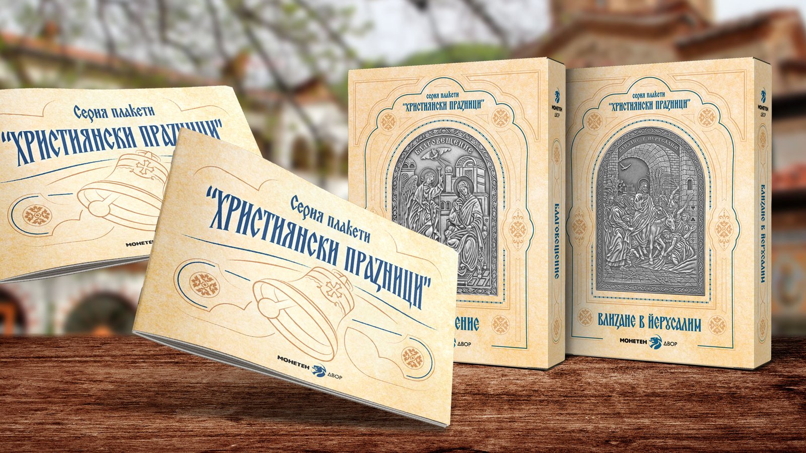
Certificate
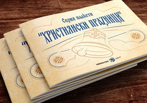
Client: Bulgarian Mint of the Bulgarian National Bank
Task: Booklet-certificate design for a series of plaques on the theme of Christianity.
Design work: The format is adapted to that of the box of the plaque where it is placed. In the cover design, I used some of the graphic elements of the packaging. I made an illustration according to the theme.

logo design
WallyBit
Task: WallyBit is a cutting-edge online trading platform that embodies speed, impetus, and height in the dynamic world of financial transactions. The logo should convey a sense of sophistication and luxury while reflecting the platform's commitment to providing a swift and powerful trading experience.
Requirements: The logo should exude a feeling of rapid movement, symbolizing the quick and efficient nature of online trading on WallyBit.
Design work: Clean, bold, easily readable sign with built-in pigeon graphics, in a rising flight altitude. The bird convey a sense of elevation, emphasizing the platform's ambition to reach new heights in the online trading industry. The color plate is a combination of deep blues, golds and silvers to evoke a sense of trust, reliability, and luxury.
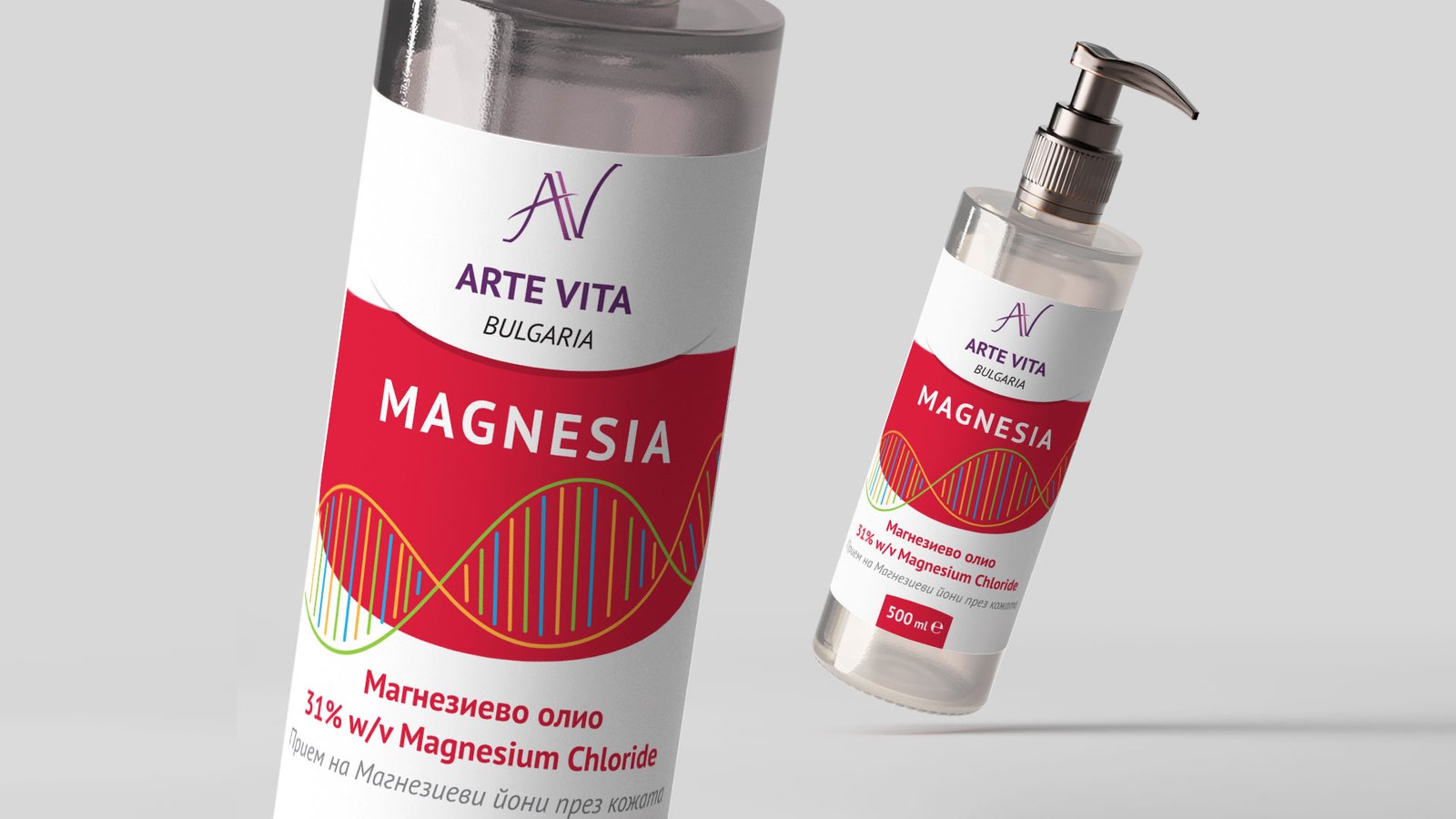
package design
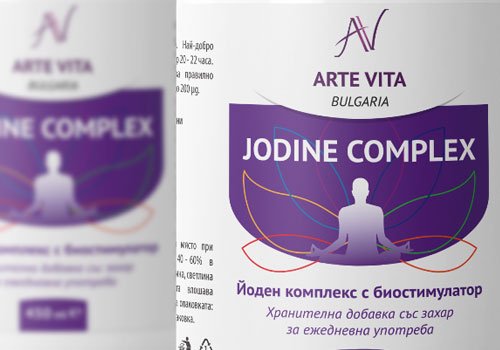
Labels
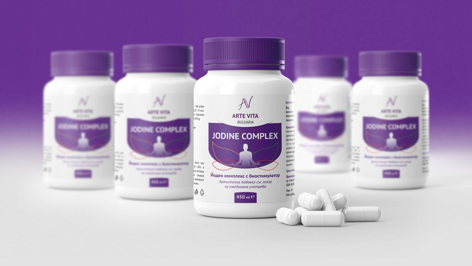
Client: Arte Vita
Task: Graphic design of labels
I created a consistent label design template for the entire product line.